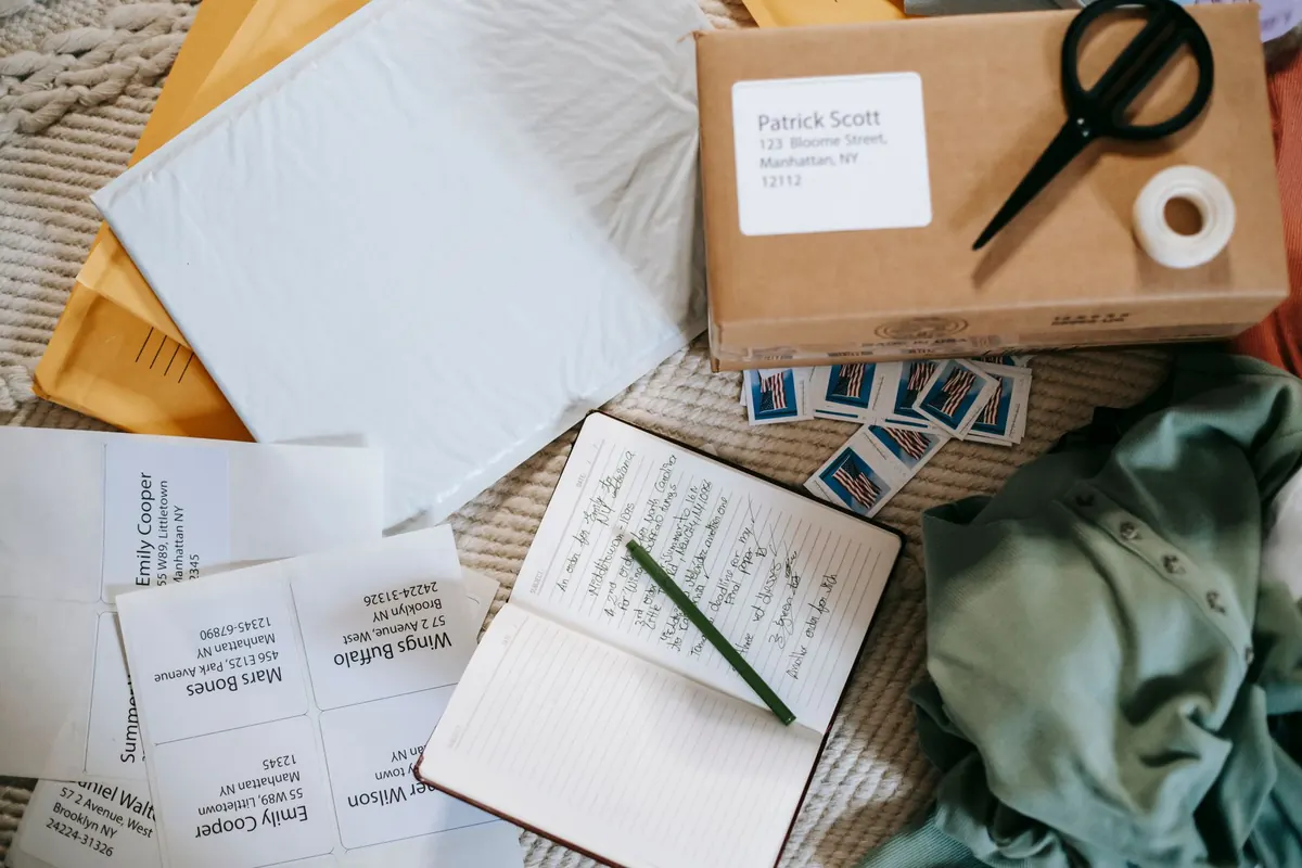
A letter arrives twice: first as an object in the hand, then as a message on the page. Most of us spend all our preparation on the message and almost none on the object, which is why a thoughtful note can feel slightly off before it is even opened — paper too thin, envelope too tight, ink blooming into the fibers.
Matching paper and envelopes is a small skill, and it takes about ten minutes to learn. You do not need a stationery habit or a drawer full of expensive sheets. You need a few numbers, a sense of how folding works, and the patience to test your pen before you commit to a full page.
Paper weight explains most beginner problems. The sheet you feed a printer — usually sold as 20 lb bond in the US, or around 75 gsm elsewhere — is fine for a shopping list and frustrating for a letter. Fountain pen ink feathers along the fibers, gel ink sits on top and smears, and the back of the sheet shows everything you wrote.
Treat 24 lb (roughly 90 gsm) as the comfortable floor for a real letter. It holds most pens, folds cleanly, and does not feel like tissue. Step up to 28–32 lb (105–120 gsm) if you write with a fountain pen or want the sheet to feel substantial in the hand. Above about 200 gsm you are in card territory: lovely for notes, but fold it only after scoring, or the crease will crack.
One quick check before you buy a box: hold a single sheet up to a lamp. If you can read the shadow of your own hand through it, you cannot comfortably write on both sides, and every envelope will show the fold lines.
The classic beginner mistake is choosing beautiful paper, writing a full letter, then discovering the only envelope it fits is so snug that the folded edge buckles. Work backwards instead. Choose the envelope, then the sheet, then the fold.
Aim for three to five millimeters of clearance on every side. And measure depth, not just width: a stack of photos inside a flat envelope will strain the flap and split the corners long before it reaches the recipient.
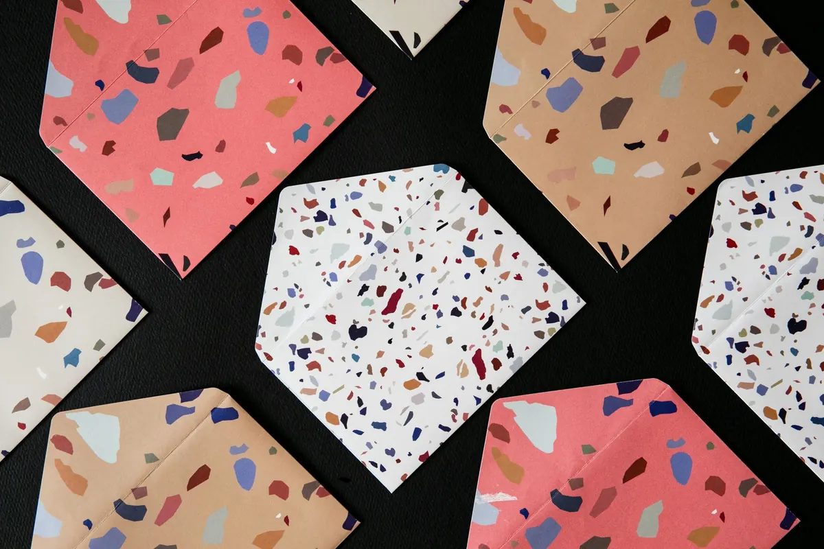
White, cream, ivory, kraft, and grey are the honest options. The rule is simple: match within a family, or contrast on purpose. Drifting between the two is what looks accidental.
Two off-whites made by different manufacturers can read as a mistake — one cool and blue, the other warm and yellow. When you can, buy paper and envelopes from the same line so the tones come from the same dye lot. When you cannot, make the difference obvious: white paper in a kraft or slate envelope, or a cream sheet in a crisp white envelope. Visible contrast looks deliberate; a near-miss looks careless.
Think about ink at the same time. Black and near-black work on any white. On cream and ivory, brown, sepia, deep green, burgundy, and navy sit better than blue-black. Pale metallic inks are wonderful for addressing an envelope and tiring to read across two pages, so keep them for the outside.
Smooth, lightly sized, uncoated paper is the safest bet for fountain pens. Cotton and rag sheets feel wonderful and have more tooth, which can make a fine nib skip. Laid paper, with its visible ribs, is happiest under a pencil, a ballpoint, or a broad nib that lays down plenty of ink. Coated and glossy card stock resists ink altogether — fine for printed invitations, poor for handwriting.
Remember that the envelope is usually a different paper from the sheet, often thinner and sometimes slicker. Test your pen on the face of the envelope and along the gum line before you write an address you cannot redo.
Address the envelope first, before you write a word. If the ink smears or the nib catches, you have lost a blank envelope instead of a finished letter. Then fold, insert, and check the fit once with your fingers before you seal anything.
If you are starting from nothing, buy three sheets and three matching envelopes rather than a box, and run one of each through the tests above. Keep a small reserve of
Photo: min o / Pexels